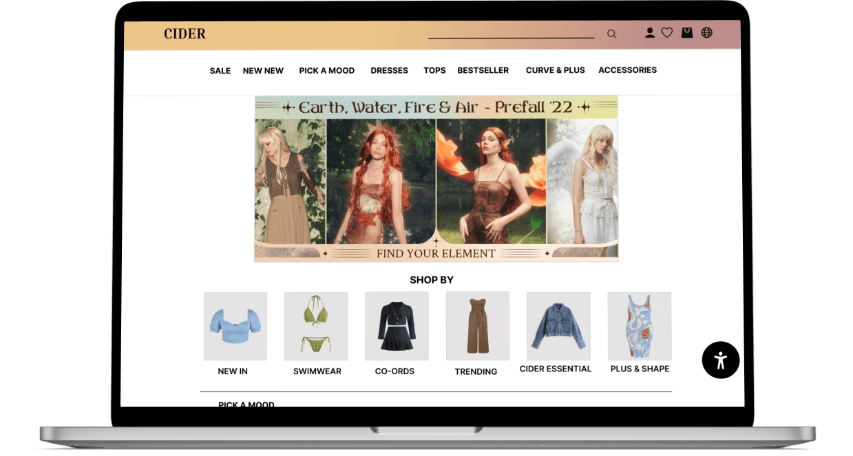
Using Sales representative and redesign methods to sell fashion products and to improve user experience
CIDER
Role
UX/UI Dsigner
Application
Website & Mobile
Tools
Figma, InVision, Google Form
Time
2weeks
Send and receive
money between African countries with ease.
OVERVIEW
INTRODUCTION
The e-Commerce industry, also known as electronic commerce, refers to the digital platform by were buying and selling of products is done online. E-commerce has changed over the past 10 years allowing consumers easy access to the online marketplace to shop, sell or advertise products. Consumers are also able to compare prices, brands, read reviews and receive exclusive discounts all this can be done effectively by using a digital device and the connected to the internet.
COVID-19 Impact on the Industry
Covid-19 had a major impact on the shift into online space seeing as retail fashion stores were temporarily closed during the pandemic, resulting in customers to turn to the online shopping world. More consumer has turned to the online shopping experience as it can be carried out anywhere on a device as effectively as going into the store. In addition, digital modification/enhancement such as AR/VR experience has been ground-breaking and extremely engaging by where customers are able to test a product without physically trying out first.
SHOP CIDER
Cider is a newly fashion brand from Hong Kong and has mysteriously taken social media platform by storm this year with some of their product going viral. It is now boasting an immense community of 2.1M followers on Instagram. It recently received a $22 million investment from American venture capital firm Andreessen Horowitz, demand on Google reached an all-time high in May, and TikTok is home to hauls with over 60 million views.
PROBLEM STATEMENT
Users prefer to use sites they are familiar with and transfer expectations they have built around familiar products. “Cider has too many items” which can cause unbearable time consumption for a consumer. The lack of function on the filter button and colour collection could leave costumers with only browsing the website without purchasing a product.
HYPOTHESIS
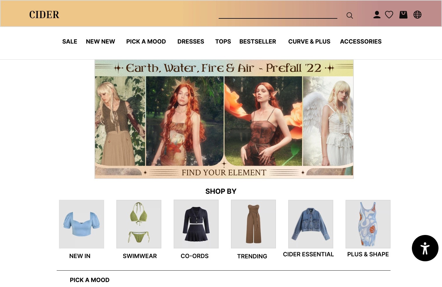
The case study I have chosen will be based on a clothing brand which is called Cider. The purpose of the redesign for Cider is to make the navigation menu as well as increasing product sales. By improving the user experience, regular users will revisit the site and purchase products. This will be carried out by using Jacob’s law and the law of common region.
Send and receive
money between African countries with ease.

EMPATHISE
DEFINE
IDEATE
PROTOTYPE
The UX Design Process
BUSINESS RESEARCH
COMPETITOR ANALYSIS
After carefully carrying out a direct competitor (Shein and PLT) analysis to collect quantitative and qualitative data about competitors companies and their products. I was able to identify the strength and weaknesses of companies their products and the reasons of their success. With this information I would be able to come up with new feature, design ideas to attract more customers.
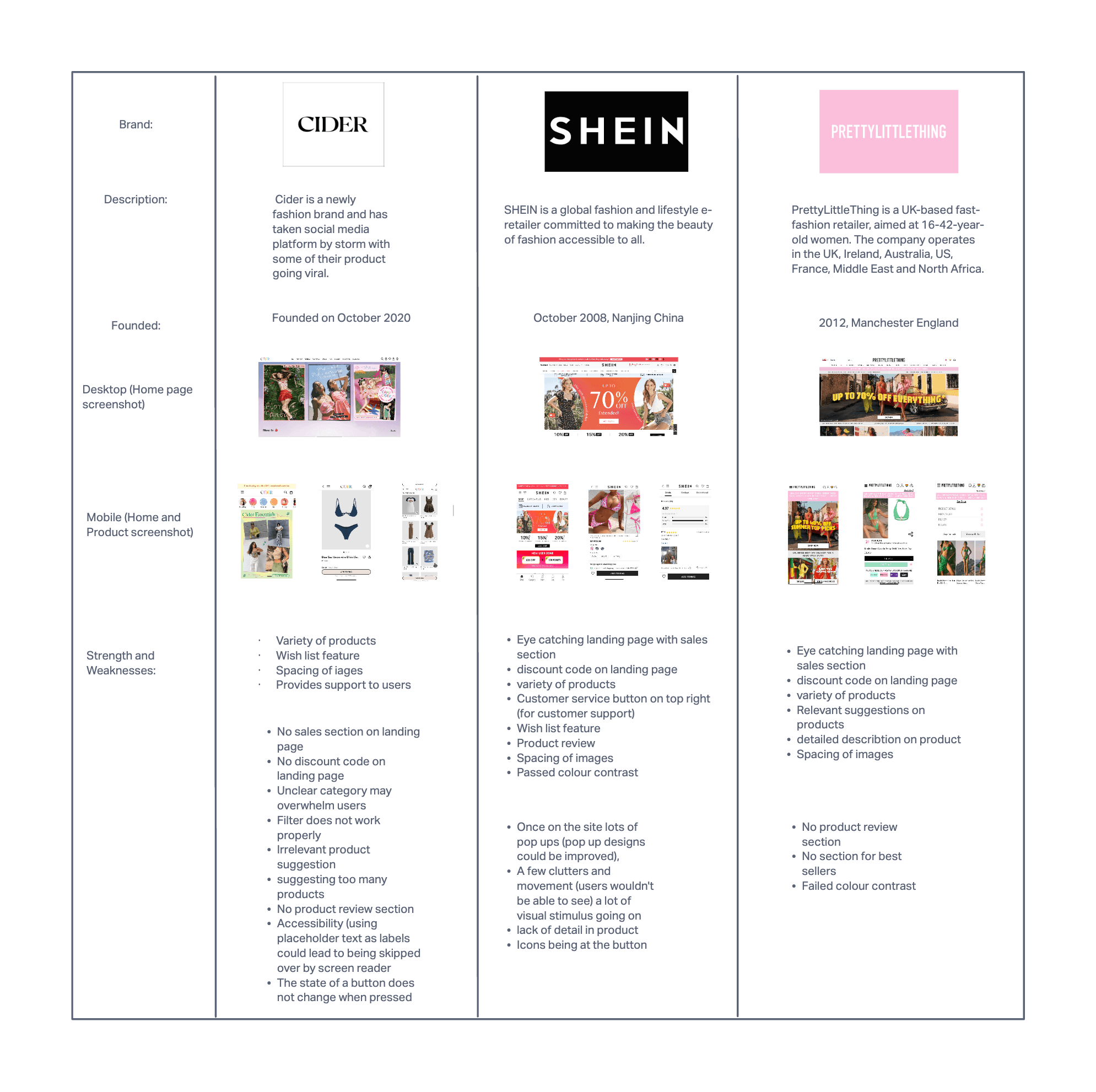
Competitor Analysis
Send and receive
money between African countries with ease.
USER RESEARCH
QUALITATIVE RESEARCH - USER INTERVIEW
I carried out a questioner to a sample of group (8-12 people) via the phone that match the chosen market and their competitors. This was carried out to gain relative insights from the results, to also understand the users pain point. The results would help in improving the user experience and their needs.
QUESTION A: General questions
What is your age?
What is your gender?
What is your location?
How often do you shop for clothes?
What is most important to you when shopping online?
What device do you use to shop online?
How was your experience shopping online?
QUESTION B: Business questions
Do you currently shop on Cider?
How would you describe your experience with Cider?
Have you ever engaged with Cider on social media?
How often do you buy items for a holiday or event?
How do discount codes affect your shopping?
What makes you shop again at the brand?

Conclusion
In conclusion I found out that users shop online because it is more convenient to them and can compare prices with different brands without having to physically go into stores. With Cider being promoted on social media (TikTok) they’re able to easily shop through there by seeing the product. By using different functions, users can have a more personalised experience such as wish list, product filters etc.

QUANTITATIVE DATA
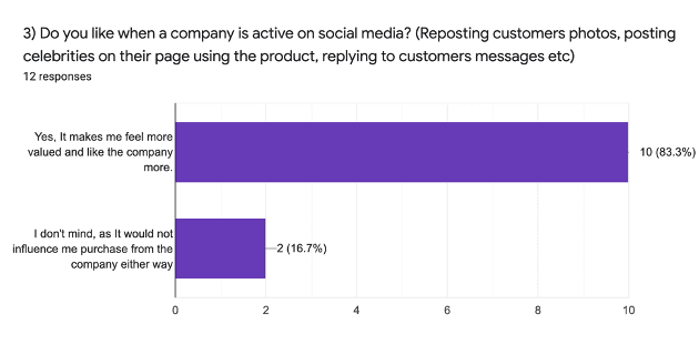
83.3% of users said that they like when a company is active on social media (Reposting customers photos, posting celebrities on their page using the product, replying to customers messages etc) as it makes them feel valued and have more of an insight on the company
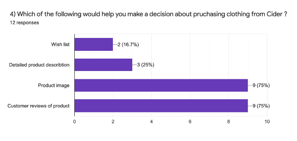
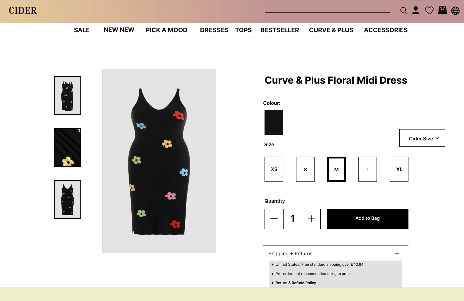
75% of users said that product image and Customer reviews would help them in deciding on purchasing clothing from Cider.
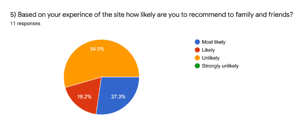
Based on the survey 54.5% of people are unlikely to recommend the Cider site to family or friends based on the improvements the site requires.
Send and receive
money between African countries with ease.
RED ROUTE ANALYSIS
I carried out a red route analysis to understand what is most important about the website, its features to users and possibly improvements. By doing this I was able to note down which feature were important as well as visualising them and to improve their experience in a way that makes them feel like the main character. This research was extremely helpful as I was able to begin visualising many different ideas for the site.
By doing this analysis I was able to identify that most users engage with features on the site, categories and sales section on the site.
The most important part that I took notice was the hero banner, were brands typically display their sale to draw in customers but for Cider it does not exist.
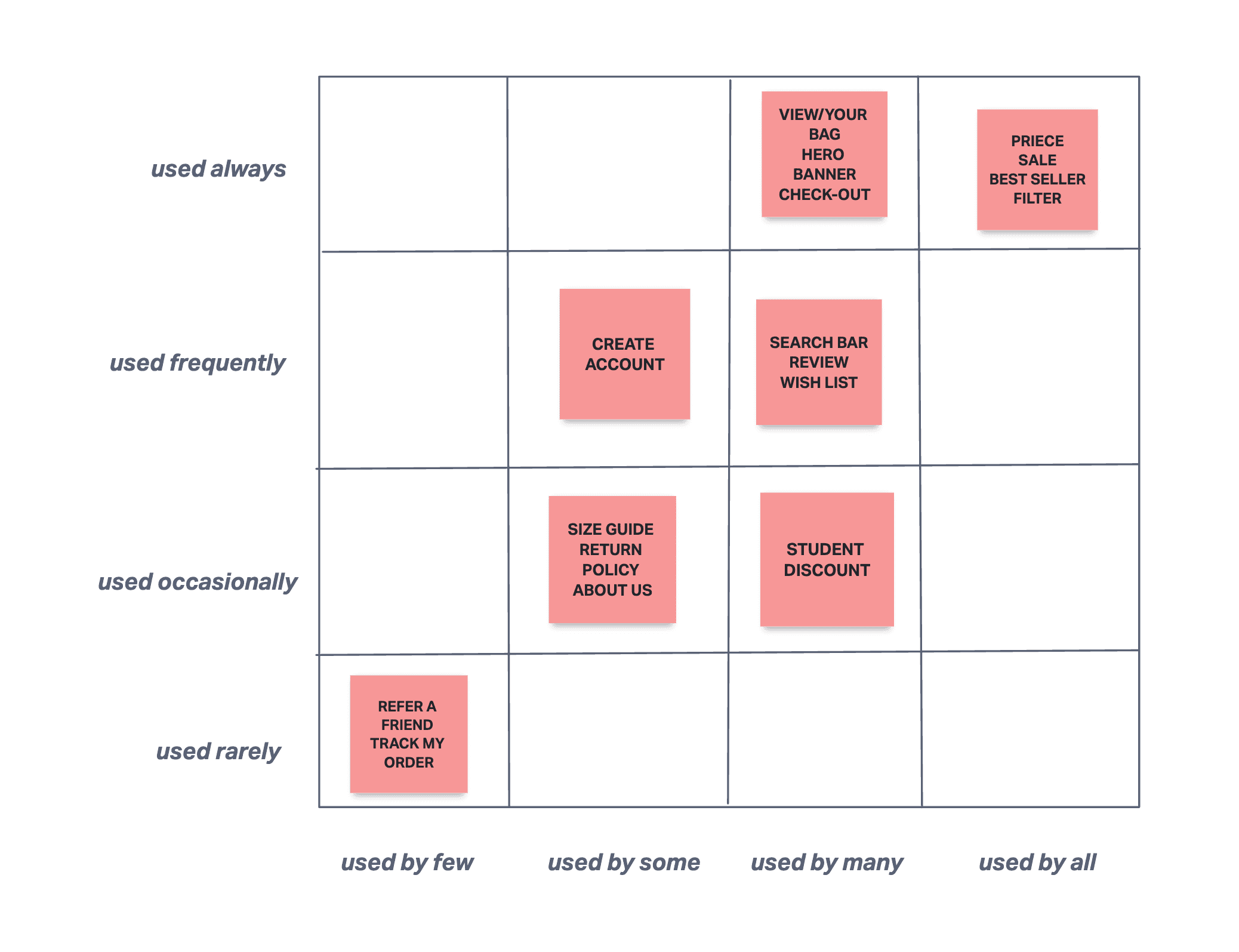
*Table of Red Route Analysis
IDEATION
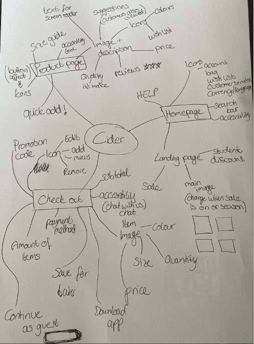
The first step I did was carry out the Mind mapping ideation method to generate ideas and design the main navigation of the website that are necessary for the website with the results I gained through research.
Send and receive
money between African countries with ease.
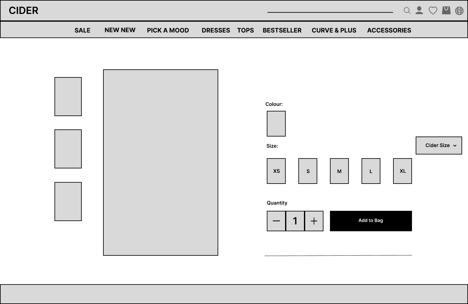
PRODUCT PAGE

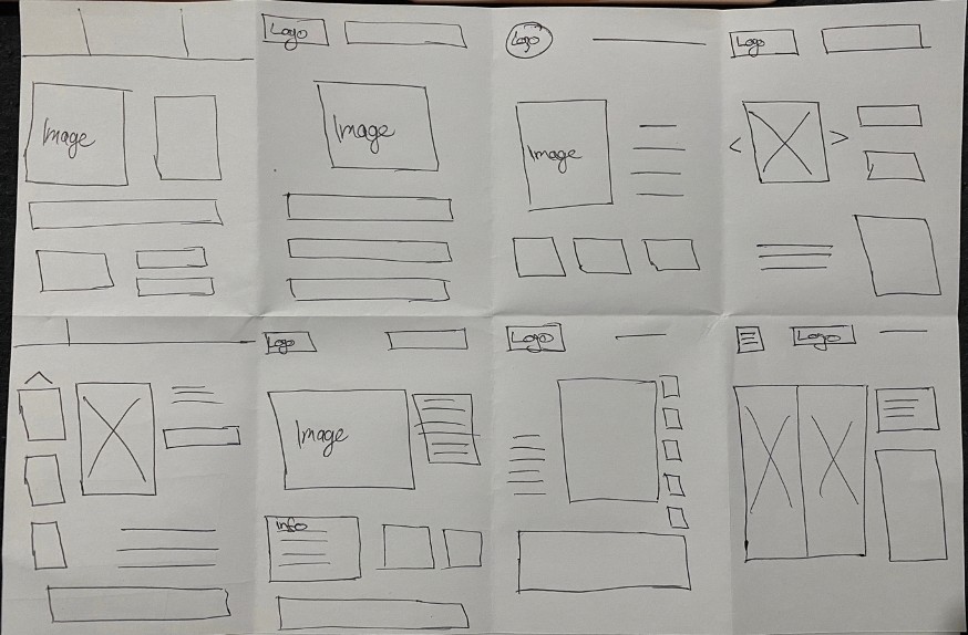
CRAZY 8
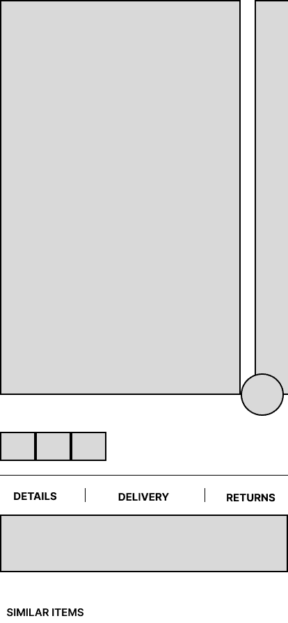
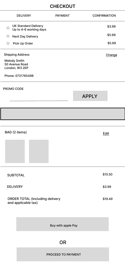
The ideation technique I used was the Crazy 8s to start off with random ideas that came to mind. By setting up a timer for 8 minutes and sketching (placing boxes and lines on Figma) on paper I was able to capture any ideas that came to mind. This has helped me to provide the foundation of the wireframe
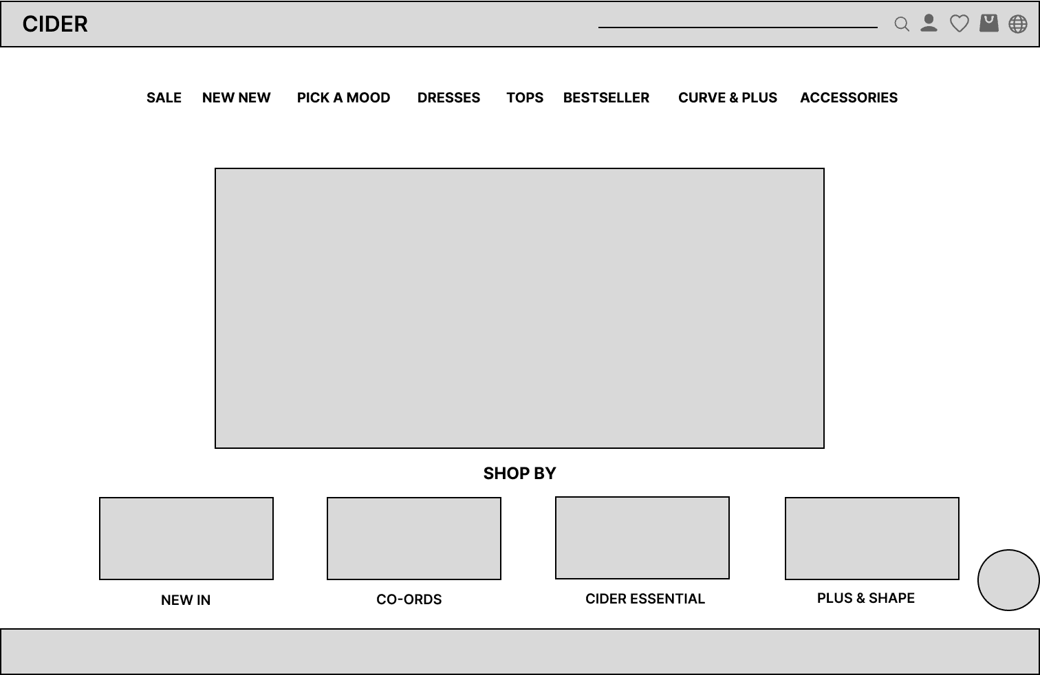
DESKTOP HOMEPAGE
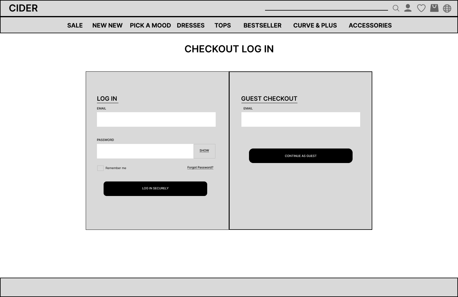
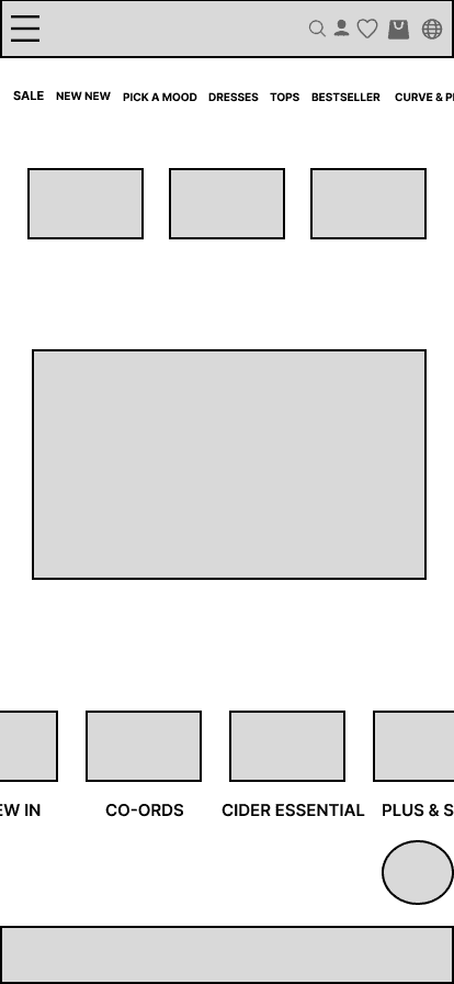
Mid-fildelity wireframe
High-fildelity wireframe
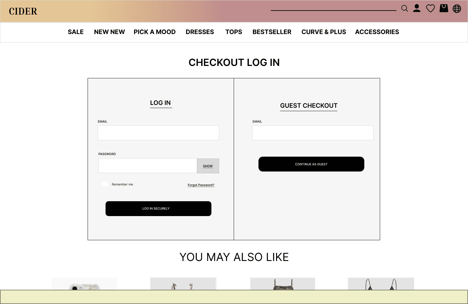
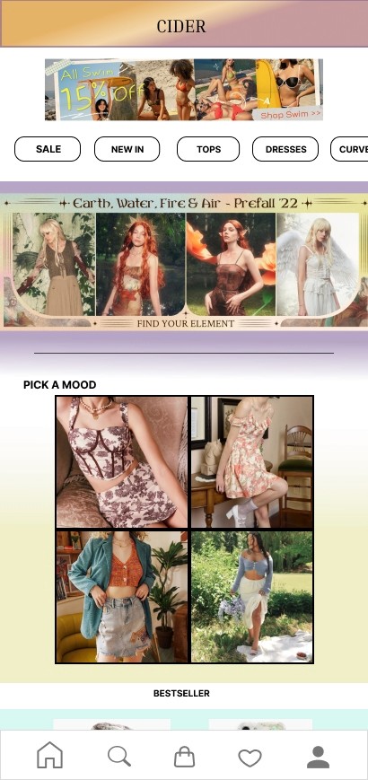
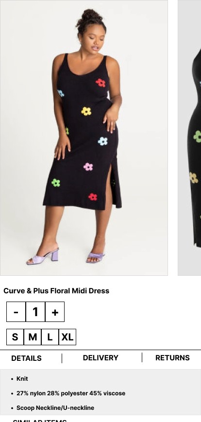
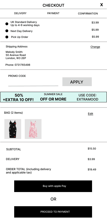
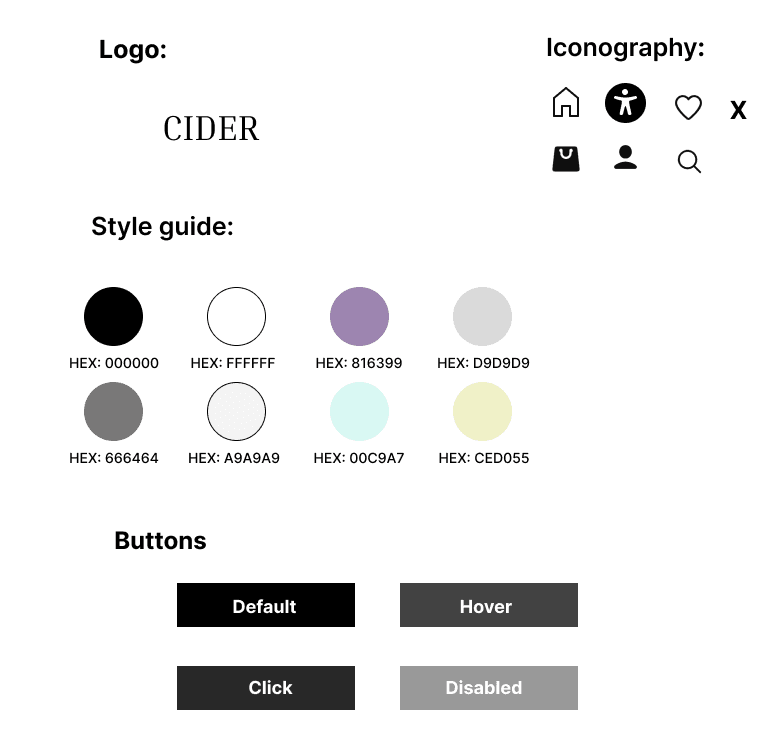
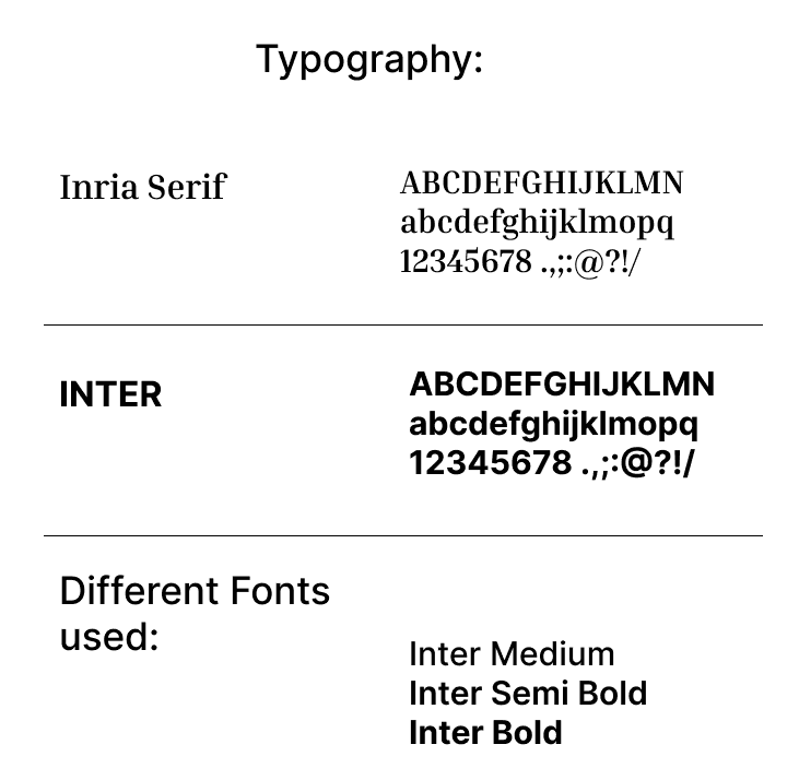
STYLE GUIDE
This project allowed me to show cast the skills I have learned throughout the months, giving me the full experience of UX/UI Designer, which was satisfying to complete. I was able to apply my design knowledge I have gained to identify the problems, solve as well as creating and designing accessible web and mobile pages from the beginning to the final product. I enjoyed the design process but because of time management issues I was unable to add more ideas. If I had more time, I would have carried out a card sorting methodology to refine products for the filter function as in my research I’ve found out that certain items were in a different category, leaving users frustrated. This feature is quite important to users based on my red route analysis therefore refining it could lead to more engagement with the website. Adding product images and Customer reviews would help and increase by 75% on decision making on purchasing clothing from Cider which is another feature I would include. I can conclude that my design solution meets the objectives from the brief.
CONCLUSION
Aesthetic Usability Effect- Researchers Masaaki Kurosu and Kaori Kashimura concluded that users are more influenced by the aesthetics of any given interface because it creates a positive response in people’s brain leading them to believe that the design works even better. For my Project I decided to use colours, images and icons to have a more attractive and aesthetically pleasing interface.
Fitts’s Law- Paul Fitts examination showed that the time required to move to a large target depends on the distance to it, yet relates inversely to its size. Fitts’s Law was added to my project because I wanted to make elements easily selectable, large and positioned close for an easy use for user’s.
Hick’s Law- This Theory is based on, the more stimuli to choose from, the longer it takes for the user to make a decision on which to interact with. I included this Law to decrease the time it takes to complete a task and fast decision making by creating a shorter path to the action I expect the user to take.
Jackob’s Law- By comparing similar apps/websites I went for a familiar user interface layout to avoid confusion nor having users to learn new models. In this case they would be able to focus on completing their intentional task.
Law of Common Region- This Law states when items are located within the same region, they are perceived as being grouped together and share some common characteristic. In my project different services were grouped with different images, this way an individual could choose the service they are in need.
DESIGN FUNDAMENTALS