Role
UX Researcher
Application
Mobile
Time
2weeks
HYPOTHESIS
This case study will be centred on a support-based app for individuals who are experiencing homelessness. The app will aim to eliminate the pressure that’s associated with homelessness, making sure support is personalised to people’s needs mainly focused on Foodbank and propose a user journey that will support and educate user’s on material which will help a homeless person to successfully participate into local community.
INTRODUCTION
There are social causes of homelessness, such as lack of affordable housing, poverty, unemployment and life events which will push people into homelessness. The people that experience homelessness or have recently been released from home/care/prison/hospital and have moved into new accommodation are in need to ensure successful local community integration.
Being tasked to develop a product that could potentially eliminate mass pressure of homelessness, I’ve decided to focus on Foodbank. Foodbanks can help if an individual is not able to afford the food they need, seeing as having a healthy diet is essential for good health and nutrient for an individual which should be available to access as well.
Tools
Figma, InVision, Google Form
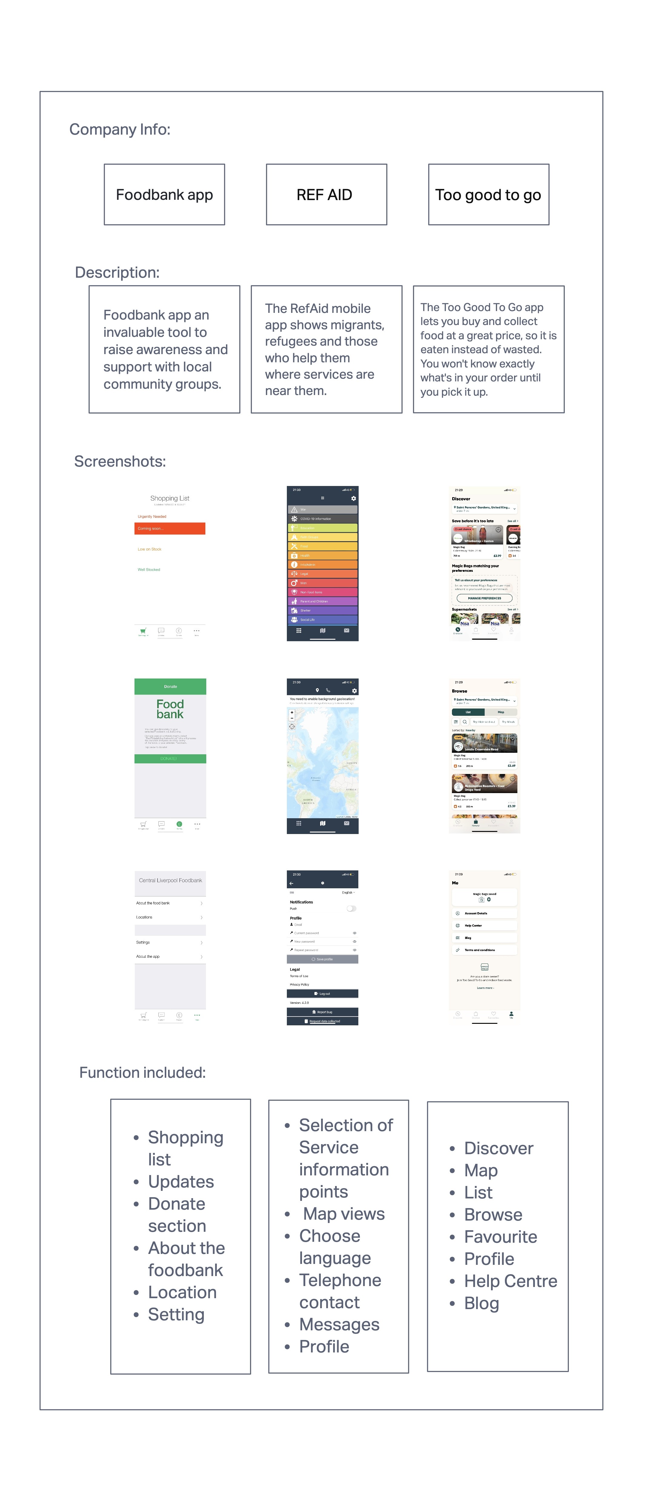
For the competitor analysis research, that I was able to gather I concluded that all the apps have an accessible, location function and clear design layout which allows for an easy user journey.
"Rough sleeping forecast to rise by 76 per cent in the next decade unless government takes action to tackle it."
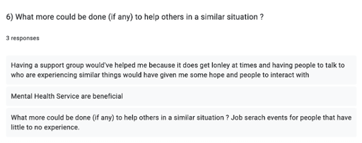
I was able to gain further insights which will later help my ideas for designs to prioritise different functions and features for the app. Having a support group, Mental Health Service and Job search events were mentioned in the survey.
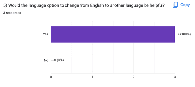
100% of users believe that the option to change English to another language would be helpful to add as a feature.
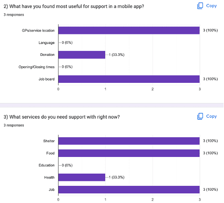
After carrying out a questionnaire I was able to gain quantitative data which allowed me to understand what the users I am targeting need as well as which function, features they value most value. All participants said that GPs/location, Donation and Job board are the most useful features and would be helpful.
For my user research I carried out a survey with 3 participants (2 woman and 1 male) age 18-24 which were nearly impossible to find. The aim for this survey was to understand what feature would be helpful. Identify users’ priority and functions that should be included. The lack of service for young homeless people, runaways and unemployment is what made me choose young individuals for my research to have a support app for them. I decided to be extra careful with the questions I asked because I did not want them to relive traumas and also to respect their privacy.
USER INTERVIEW QUESTIONNAIRE
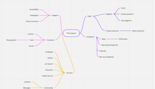
Mind Mapping
IDEATION
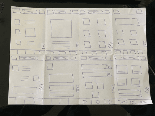
Crazy 8s
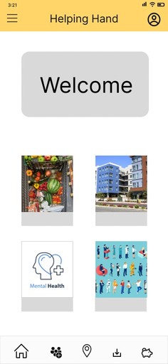
High-fildelity wireframe
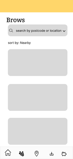
Mid-fildelity wireframe
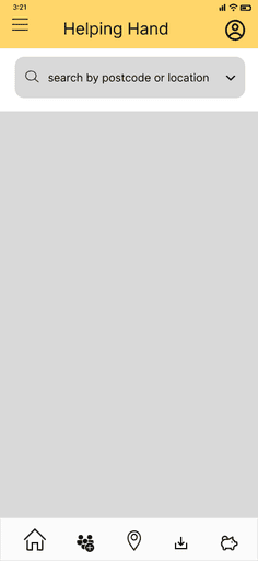
Low-fildelity wireframe


Wireframes
Aesthetic Usability Effect
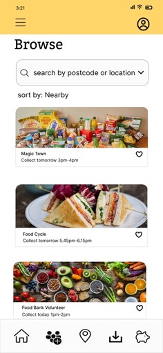
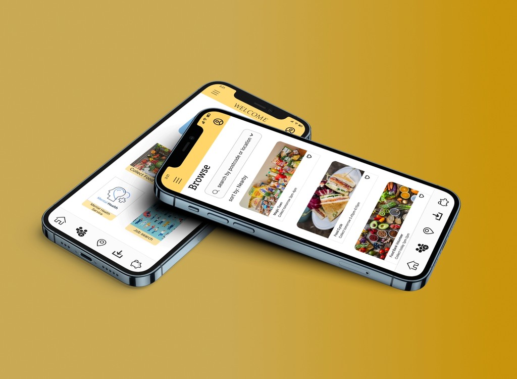
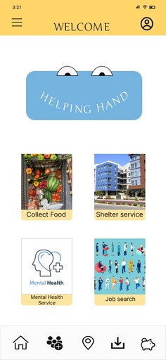
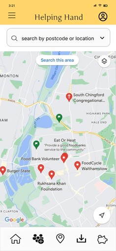
Researchers Masaaki Kurosu and Kaori Kashimura concluded that users are more influenced by the aesthetics of any given interface because it creates a positive response in people’s brain leading them to believe that the design works even better. For my Project I decided to use colours, images and icons to have a more attractive and aesthetically pleasing interface.
Jackob’s Law
By comparing similar apps/websites I went for a familiar user interface layout to avoid confusion nor having users to learn new models. In this case they would be able to focus on completing their intentional task.
Law of Common Region
This Law states when items are located within the same region, they are perceived as being grouped together and share some common characteristic. In my project different services were grouped with different images, this way an individual could choose the service they are in need.
Design Fundamentals
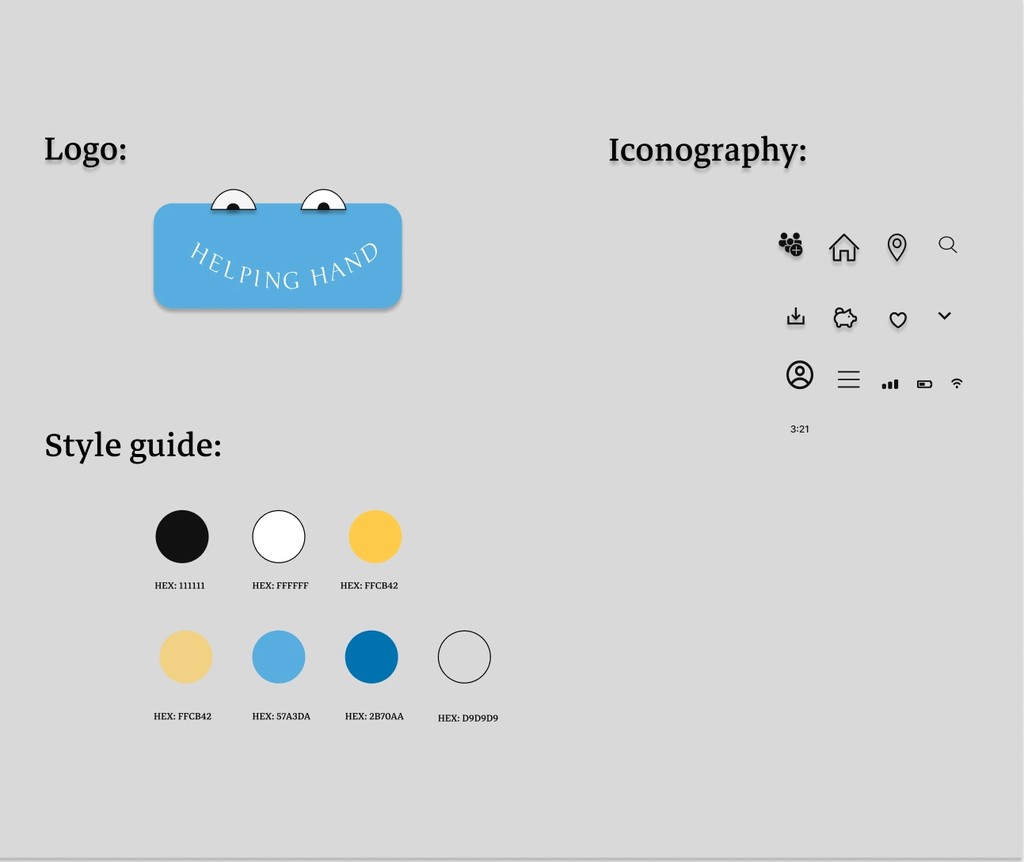
STYLE GUIDE
For the Typography, font sizes of 14px and higher were used for people to comfortably read it. Making sure that the area for clicking controls such as buttons, links, check boxes etc were large enough and met minimum touch area for people to activate them was also included in this project. Controls that are small or close to each other, result in difficulty of usage.
I added a noticeable accessibility icon on the bottom right corner to control the device as it would have many accessibility features to support vision, physical and motor hearing and learning needs.
Conclusion
This Case Study was quite overwhelming, only because the data I gathered were from close friends or people I’ve worked with. Having to listen to their struggles and vulnerability was something I could not prepare myself for nonetheless I was able to emphasise with them and using their experience to add to my knowledge. I was able to put myself into their shoes and think of design ideas that could have improved their journey but also help others who are facing such difficult times.
Self-reflection
If I had more time, I’d definitely run usability test to identify if user’s are satisfied with the user experience as well as to see if I met the user’s goals making sure support is personalised to people’s needs.
For this Case study, I wanted to ensure that my designs meet the minimum requirements for W3C to include everyone on the access of web content. In the UK, 1 in 5 people are disabled and 40% of household have at least one disabled person. Creating inclusive digital design products allows a range of diverse people to access products.
Doing this I included accessibility, usability and most importantly empathy. Adding enough contrast was important for Colour accessibility because it allows people with visual impairments to interact with digital experiences. This was tested by using a Figma plugin Contrast to check that my designs met accessibility standard.
WCAG Guidlines

